

Earlier this fall, UFV’s Canada Education Park (CEP) campus’ coffee shop underwent a rebranding, from Tim Hortons to the Spirit Bear Café. Abbotsford has one too, which replaced the old Roadrunner Café. The name comes from a Richmond-based, First Nations-owned, organic, fair trade coffee roaster. That’s all fantastic, and it’s great to see UFV move away from a chain restaurant (who restricted what could be offered on the menu) to a smaller, more local business. However, there’s one major issue with this change in branding: the signage.
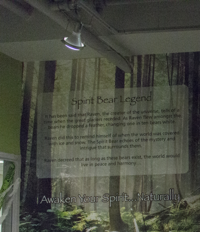 The box of text on the wall behind the coffee shop is a great idea. It tells the legend of the Spirit Bear in a brief enough format for customers to read while they wait for their coffee. But, while the story itself is written in a clean, Sans-Serif font (that is, clean-edged letters, instead of overhangs like you see on the top and bottom of a capital I in The Cascade’s font), the top and bottom of the sign feature large text written in a font called Papyrus.
You may have heard of Papyrus before. It’s a default font on both Windows and Mac computer, and has been around since the 1980s. Maybe your graphic designer friend rants about it sometimes, or perhaps you saw that Saturday Night Live sketch from the beginning of October where Ryan Gosling obsessed over the font’s use in the poster for the movie Avatar. You’ve definitely seen it before. The thing about Papyrus is that, once you start looking for it, you’ll find it everywhere.
While it’s hard to say what Avatar’s excuse is, in a lot of cases it’s not hard to guess why Papyrus gets used. It stands out from the list as you scroll through the overwhelming number of fonts on a computer, and for a fledgling company designing its own logo, it looks like an exotic, eye-catching choice. It can give off an earthy, natural feel, like Spirit Bear is going for, or it can be a mystical choice for fantasy novels or metal bands. However, at a certain point, a company needs to hire a professional designer, and a professional designer should know better. It just doesn’t look good, and it doesn’t stand out (in a positive way) from the crowd of other places using it.
There’s no shortage of places online where you can go to see examples of poorly placed Papyrus, since, alongside Comic Sans, it’s one of the most commonly derided fonts in existence. But unlike Comic Sans, which has strong defenders for its practicality (some dyslexic people find it much easier to read than other, more “standard” fonts), there aren’t many defenders of Papyrus. There are other, more unique, better looking “mystical” fonts out there, available for free, that can make your brand stand out, rather than making it look like you didn’t hire a designer.
It’s a minor quibble, to be sure, and certainly not worth spending significant amounts of money to fix. The Spirit Bear Café can keep their signage as is for the foreseeable future. That’s fine. But perhaps, when the time comes, touch up the paint on that eye-catching photo displayed on the wall. It’s worth considering a change in the font.

Jeff was The Cascade's Editor in Chief for the latter half of 2022, having previously served as Digital Media Manager, Culture & Events Editor, and Opinion Editor. One time he held all three of those positions for a month, and he's not sure how he survived that. He started at The Cascade in 2016.
