
By Jess Wind (The Cascade) – Email
Print Edition: September 18, 2013
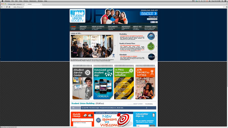
This fall, the Student Union Society (SUS) launched its new website and thinned out its old agendas in an attempt to modernize.
The move makes sense, considering the old website was incredibly bare bones – a throwback to website-surfing from decades past, back when pages featured few graphics, simple 12-point Helvetica or Arial or any of those other default fonts, and next to no links for easy site navigation.
It is confusing, then, that the redesign seems to have made the website more scattered and dysfunctional than before.
As someone who regularly frequents the SUS website and needs to pick through the information on it, I can say that it still needs to take some steps in a user-friendly direction.
First of all, it is too busy.
When you first arrive at the page, the combination of bold colours and graphics makes for a visual mess; it takes a few moments to figure out what you’re looking at, then to remember why you came to the website.
Once you’ve gotten past the initial shock, you begin to scroll up and down the page. On the right is a series of badges that Ash would have pinned to the inside of his vest on his quest to become a Pokémon master. There’s no harm in video game-esque imagery, but with all the other graphics littering the site, they come off as campy and random rather than unique and intentional.
Now, suppose you want to contact someone in SUS directly. You would think clicking on the tab at the top, “About SUS: Meet Your SUS Board,” or at the bottom, “Our Team,” would take you to a list of those people with their names and email addresses. Instead, both links take you to an informational page about what SUS is. Lo and behold – a red heading that says “Our Team” and looks like every other non-clickable heading on the page is, in fact, the link to the list of SUS team members.
Yes, the competent web surfer hunting for this information would be able to find this link buried in the site, but for someone who is new to the site or to SUS, it should be more readily available.
Outside of navigation, the real pitfall with the redesign (which I can only assume is an easy fix) is the font. The entire site is in stock Arial font and too small for anyone to spend time reading. Even on a 27 inch screen, it is labour-intensive to get through any of the text. Someone looking to register a club or learn about the Student Union Building (SUB) has to work through heavy blocks of text in this tiny font. Add to that inconsistent spacing and scattered spelling mistakes that my own OCD can’t handle, and I find myself missing the simpler SUS site from before.
Granted, the site has more useful and relevant information on it, and it seems that SUS is staying on top of updating it regularly (something lacking in the old site). As well, the thinned-out agendas are far less distracting than they used to be.
However, these are small victories.
A functional, dynamic website was a long time in coming, but there are definitely still places SUS can make improvements so their members have the level of access to the society they deserve.