Print Edition: March 13, 2013
Shane Potter
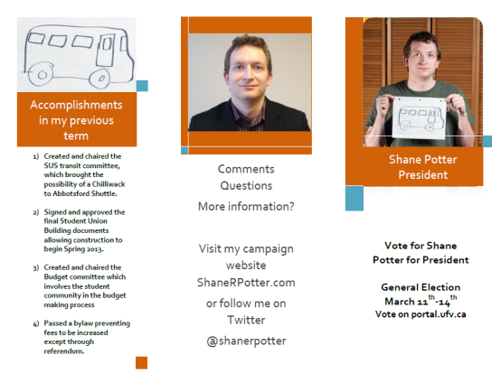
 Dessa: We’re looking at a basic poster here, which isn’t bad, but I’m a big fan of putting a face to a name — a headshot would have gone a long way toward spicing up the black and white partitions. Otherwise I think the simplicity works.
Rather than a second poster, Potter went with an informational brochure, which is an interesting choice. It certainly allows space for more explanation about what he plans to do and what he’s already done.
Nick: My biggest question with the informational brochure is one of distribution. It’s easy for students to see a poster in the hallway and get a little information, but unless Potter is going around handing out the brochures, it seems a bit like wasted energy.
To be fair, his website also contains most of the information included in his brochure.
My favourite part about the simplicity, though, is that it largely avoids listing campaign promises that could never be fleshed out properly within the attention span of the average student on the way to class. Instead, it points them in the direction of further information that they can look up later.
Stewart: Simple, minimal and uninspired. Still, the poster is clear in its execution. It works to generate name recognition. I like how the poster moves from black to white. It works effectively to break up the text. Due to the lack of colour, it looks like every other piece of clutter on the poster boards. Is Shane Potter campaigning in stealth mode?
Verdict: Text 4/5 Design 4/5
Mehtab Singh Rai
 Nick: Rai’s first poster is catchy. I mean, who couldn’t love that winningly mischievous smile? The misplaced apostrophe makes me cringe, but those sort of grammatical errors seem to be par for the course so far.
His goals are ambitious but I’m not so sure he can pull of such a big task as eliminating interest on BC student loans in one term. It’s great to see a candidate reach for the stars, but I wonder whether it will be at the expense of more local issues or the day-to-day management of the SUS.
Dessa: I’m going to chime in whole-heartedly about the misplaced apostrophe — I’m sorry, but I’m still cringing. Will that really affect the majority of the voting student body? Probably not. But I noticed, Mehtab — I noticed.
Turning to advice mallard, I’m pleased to see a candidate use a humourous, conversational approach to campaigning. For those not acquainted, this image is the “Advice Mallard” meme often found on internet forums, and the text is just generally good advice. (Not to be confused with “Malicious Mallard,” whose “advice” is guaranteed to land you in hot water one way or another.) The use of a meme, however, leads me to the problem that not everyone is familiar with this image. This is bound to leave some students baffled at the use of a duck.
Nick: Like me. I’m not familiar with this meme, despite being a fairly typical 20-something internet user. Right over my head.
Stewart: Of all the posters, I actually notice this one as I pass by in the halls. Mehtab is clearly enjoying himself. That wouldn’t stop me from making a few changes. The name has to jump out more. I would place Mehtab’s name at the top. Be careful with the choice of images as well. The picture of the duck does not make sense. It makes it so there is no connection between the two posters. Always check for spelling and punctuation; that can’t be overlooked when designing a poster. The mistaken apostrophe serves as an unneeded distraction and unwanted embarrassment.
Verdict: Text 3.5/5 Design 3.5/5
Zack Soderstrom
 Dessa: Well, this is on the side of simple. On the other hand, there are no competing posters from Willms, who is running for the same position. As Soderstrom demonstrates, it doesn’t take very much effort to throw some words on a page and print them off. In ordinary circumstances, I’d want to call Soderstrom on his lack of effort — but compared to the alternative, which is nothing at all, he’s looking pretty good. You don’t need to be flashy to get a message across.
Nick: Soderstrom is quickly building a reputation for short, well-aimed bursts of energy. He’s efficient and his posters reflect this lack of fussiness. I could see his posters actually standing out for their simplicity. Some students might appreciate something less concerned with appearances than getting the basic message across. Soderstrom comes across as a populist rather than a slick politician.
Stewart: I am going to need a little time to reflect on this one. Simple and to the point.
Verdict: Text 3/5 Design 2.5/5
Kristianne Hendricks
 Nick: Kristianne’s poster isn’t the best designed, but it’s the most substantial we’ve looked at so far. For students who take the time, she outlines lots of specific ways in which she’ll carry out her role as VP academic if elected. I think the inclusion of her student email and Facebook page are great additions. They make it easier for students with questions to get in touch and point them to further info.
Dessa: I’m on board with seeing her email and Facebook page front and centre — I feel like it makes her a little more grounded, since she immediately backs up her promise to engage with a way to engage. Like I’ve mentioned, I’m also a huge fan of seeing faces on posters. It’s a way to make it stand out and connect the face to the name. It’s not the most flattering picture in the world, but she’s willing to put herself out there – and that counts for a lot.
Stewart: This poster fails in generating any name recognition. A candidate’s name should be the most visible text on the poster and Kristianne’s choice of font makes it barely legible. Still, I think it is great to have a face to go with the name. There is nothing here to grab the attention of the voter as they pass in the halls.
Verdict: Text 4/5 Design 3/5
Natalia Deros
 Dessa: Not sure how I feel about this picture of Deros … having a picture is good, but what’s the significance of the Harry Potter reference?
Nick: I think she ties it to the fact that the poster outlines her “platform.” I feel like making the reference a little less subtle might have helped; tying herself to the wizard-y J.K. Rowling series is sure to win her some votes.
Dessa: Oh! I get it. Okay. I can see that. Yeah, aligning herself with Harry Potter is never bad, because I have yet to meet anyone who is completely against the wizarding world. I think Clubs and Associations rep has to be whimsical in a lot of ways, so this is a good way of showing that.
Her goals also balance between informative and doable, without diving into vague or oblique promises. This might be the best information poster we have so far — it’s simple, but we get a clear sense of her as both a person and a political candidate. She’s got my vote, that’s for sure.
Stewart: This is an example of what not to do, unless you want to campaign in stealth mode. Again, make the name visible. I like the Harry Potter reference. Charming.
Verdict: Text 5/5 Design 3/5
Sarah Gabor-Martinez
 Nick: It seems Gabor-Martinez is intent on getting the varsity vote, taking the athletics slogan “Think Green” to the next level with this verdant poster. It also suits her main campaign promise: to make UFV the fourth fair trade campus in Canada.
Dessa: Varsity vote? Remember that the university as a whole claims the colour, not just athletics. I don’t think “verdant” shades by themselves are enough to get the basketball teams raring to vote for her — just saying.
This seems like the poster that’s had the most work put into it, and it’s pretty to-the-point about her goals. Add a candidate dressed as an ear of corn, and the poster lacks nothing. As possibly the most obvious connection between SUS and the greater UFV student community, reps-at-large have to be outgoing and willing to try anything to get attention – which Gabor-Martinez has already figured out.
Stewart: The colour scheme is an odd choice. I see there was some effort. If you are going to have a picture, make sure the face is visible and easily identifiable. The candidate’s name needs to pop out more. I would place the campaign promises at the bottom. Getting name recognition is what matters most when running a campaign. It is the name that shows up on the ballot, not the campaign promises.
Verdict: Text 4/5, Design 3.5/5
In Conclusion
Nick: There we have it, this year’s SUS posters. We’ve seen spelling and grammatical mistakes, vague rhetoric, odd colour schemes, fuzzy photographs and stark simplicity in this year’s field. It’s a little bit charming to see inexperienced politicians try their hand at graphic design. Dessa, how important do you think posters are to an effective SUS directorial campaign?
Dessa: Considering only four people showed up to watch the Abbotsford all-candidates meeting, it’s pretty safe to say that posters are the main way the election message gets out to the student populace. Less than half the candidates put together posters, and I think good things can be said about those that did — whether the posters themselves were decent is another matter entirely.
Stewart: Walking through the hallways of UFV, I would hardly notice that an election is actually happening. I can tell that little thought or enthusiasm went into these posters. In the future, I would like to see a more colourful effort from the candidates to get their names out. An effective poster can be the difference between winning or losing. Generating name recognition is a must and that is the point of a poster. It is clear some of these candidates failed to take advantage of that. Good luck to all the candidates!
Nick: One thing I’d love to see in a campaign poster would be a QR code. Posters could be a little less information heavy and focus on what I think their main function should be: driving student voters to websites and Facebook pages so that students can make a more informed decision.
Dessa: Do people actually ever scan QR codes? Cool factor is way high, but useful factor is definitely debatable. But I bet you we’ll see some keener try it in the next year or so – I just bet you.