

By Domingo Flores (Fashionista Extraordinaire) – Email
Freezing isn’t fashionable. What is fashionable is maintaining your body at a comfortable temperature. To quote the great Donatella Versace, “Fashion is all about happiness,” and what better way to stay joyful in the face of a dull, dreary, wet, and windy winter than by staying abreast of the ever-changing ocean of imagination that we call fashion?
In this, the most rugged of landscapes, where we are forever enticed by the hiking trails and the forests, simplicity is key. Not for us here in B.C. are the airy silks and soft suedes and velvets. Instead we must look to the warm wools and cottons, the corduroys. But just because our climate dictates that we bundle up, doesn’t mean we can’t spruce up our lives with our clothing!
Generally speaking, the more high-faluting, snobby fashionistas will advocate for earthier tones during the winter, maintaining a monochromatic hold on our visual sense, even during these, the most monochromatic months of the year.
Nay, I say, nay to the idea of greys and blacks dominating our winter wardrobes! Let us brighten our lives and days here in the cold, colourless north by brightening our clothes. Let us enjoy the simple pleasures in complex colours.
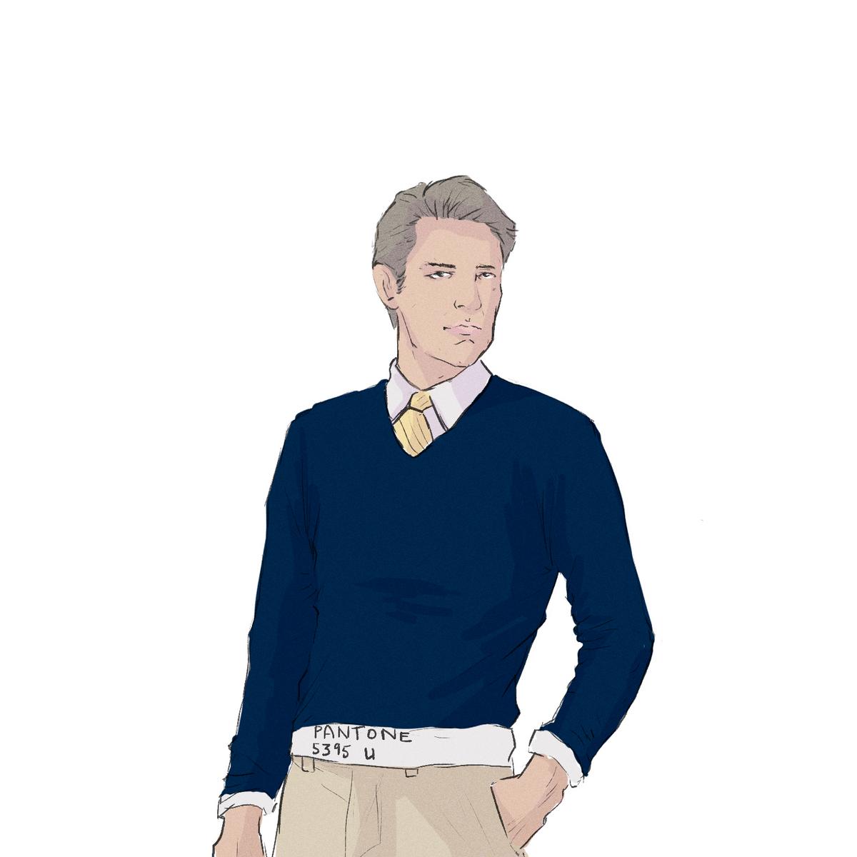
This is a time where strong colours — teals, maroons, reds, and oranges — should roam free across the landscapes that are our bodies, that are our clothes. Highlight your eyes and hair by wearing a complementary colour. Coordinate your clothing so that two-tone colour variations swirl and shift, encircling one another and ensorcelling any and all around you.
Choosing colours that lie opposite one another on a colour wheel is a time honoured technique used by artists across time and space. Even movies and graphic designers make use of this simple technique, which is why you often see bright blue and orange on posters and in films. And yet … Despite the fact that this is such a commonly used technique across many disciplines and media, we haven’t fully included it in our fashionista repertoire. Despite the fact that by matching you’ll be creating a more visually attractive, more viscerally stunning style, we are, as a majority, still hesitant to do so. Afraid to take the plunge into the metaphorical paint bucket.
But we should check our fears and step forward courageously into a colourful new world. It’s a whole new world, a vibrant world, one where another avenue of expression awaits us.
After all, colours have always carried with them emotional meanings and themes. Reds are more passionate, more brash and dominant; whereas blues are calmer, more reasoned, and more submissive; yellows are associated with energy, enthusiasm, and optimism. These three plus a host of others, the more out-of-the-box colours such as the regality of purple and the virility of green; can easily be used to establish an emotional aspect in one’s choice of clothing.
Want to show everyone you meet that you’re feeling positive and looking forward to the day? Highlight your clothing with yellows. Want to extend a sense of calm while also subtly establishing yourself as a dominant figure? Use some purples. Want to give off an excited, vivacious, slightly intoxicating vibe of yourself as charismatic and magnetic, “large and in charge?” Reds are your go-to.
As the poet Leigh Hunt once said, “Colours are the smiles of nature.” So why not get out there and wear those smiles, and through this act encourage others to smile, both physically and stylistically. There’s always colour to describe exactly how you’re feeling.


